Earlier this week I wrote out a multilevel model. It had fit well (though slowly) and I spent a happy hour admiring the chains, checking the coefficients, plotting posterior values. Life was good and easy; merrily did I sail before a fair breeze and a clear sky. My next port of call was to plot some smooth fitted lines, aka “counterfactual predictions”. Ah yes. Predicitons!
Wait. What kind of predictions? For the same groups I’ve already measured? No, for new groups? no, for some combination? Perhaps yeah, maybe that. OK let me get my posterior samples ready, I think I need to simulate some things, preserving that correlation.
Alas. Winds of confusion on all sides. My progress falters, founders on hidden shoals, and coldly the waves of doubt close over my lost little head.
Fear not, weary voyager, Andrew-of-the-past, this short post is a buoy in the tempest, a rope in the malestrom, a bit of timber to cling upon! And who knows, perhaps some other storm-toss’d traveller will see from afar this feeble light, and take heart?
er, let me be specific. This post is my notes on making posterior predictions with and without random effects. It took me almost two days to learn this; hopefully I can remember it forever and also save you some time too, dear reader!
What we talk about when we talk about random effects
The specific shoal that I crashed onto was described in McElreath’s Statistical Rethinking:
All of this is confusing at first. There is not uniquely correct way to always construct the predictions, and the calculations themselves probably seem a little magical. In time, it makes a lot more sense. The fact is that multilevel models contain parameters with different focus. Focus here means which level of the model the parameter makes direct predictions for.
He goes on to recognize three cases where different kinds of “focus” are required:
- when you retrodict the sample (as one does when making posterior predictive checks)
- when you make new predictions for the same groups
- when you make new predictions for different groups
The first two options are quite similar, different only in that the second might involve some counterfactual prediction (like a regression line). In both of them, you want to use your model’s estimates for the effects (intercepts, slopes etc) of each group. It might be that you wanted your random effects here to help you get better parameter estimates via the phenomenon variously called “shrinkage” , partial pooling, or sharing strength.
In the third case, you’re not into the groups at all. Here, you are interested in where the groups come from. Maybe you took a look at 12 plots, but you want to know about all possible plots. Or only on three years, and you want to know about all possible years.
Making predictions easy
The best way to get a handle on the two kind of predictions is to learn how to make them. And the best way to make sure you’re making them correcty is to plot what you’ve made and see if it makes sense.
Working through McElreath’s wonderful book gave me lots of practice making posterior predictions. However that gets more and more tedious as models get larger – and also, just knowing that there is an automatic way to do something is an instant argument to go learn about it. In this example, I’m going to fit these bayesian models using the wonderful brms package by Paul-Christian Bürkner, which you should definitely study because it is the R package equivalent of the 100 emoji.
I had been working with brms all week, extracting the posterior samples by hand and carefully joining them to my data to generate predictions. That’s when I happily stumbled upon tidybayes by Matthew Kay, and then I promptly forgot to eat lunch. WHAT A PACKAGE! It replicates some of the tidy data principles for bayesian data, and does it much better and more safely than all my cobbled-together machinery. If you’re all about that Bayes, clear yourself some time and study it.
There are lots of good things about both tidybayes and brms that I’d love to write about, but right now on to posterior predictions. I’m going to reproduce some of the figures from Chapter 12 of the book – 12.5 and 12.6 respectively1 – in order to make sure that I can see that I’m getting the random effects I think I am.
Overdispersion in linear regression
This example features a dataset about the number of tools and log population sizes of different island societies. This dataset is featured in several examples in Rethinking and its dimensions are, shall we say, modest:
data("Kline", package = "rethinking")

knitr::kable(Kline)| culture | population | contact | total_tools | mean_TU |
|---|---|---|---|---|
| Malekula | 1100 | low | 13 | 3.2 |
| Tikopia | 1500 | low | 22 | 4.7 |
| Santa Cruz | 3600 | low | 24 | 4.0 |
| Yap | 4791 | high | 43 | 5.0 |
| Lau Fiji | 7400 | high | 33 | 5.0 |
| Trobriand | 8000 | high | 19 | 4.0 |
| Chuuk | 9200 | high | 40 | 3.8 |
| Manus | 13000 | low | 28 | 6.6 |
| Tonga | 17500 | high | 55 | 5.4 |
| Hawaii | 275000 | low | 71 | 6.6 |
.. that’s literally the whole thing.
We’re going to create posterior predictions for this data. The first step, of course, is to fit a model! Here I’m fitting the very same model as in Rethinking, though I am using brms and not the rethinking package as in the book. The thing to notice is the (1|culture), which fits a varying intercept for each culture (each little row) in the whole dataset! These intercepts are a handy way to measure “overdispersion” relative to what we would expect2 see in count data.
library(brms)
library(tidybayes)
library(tidyverse)
library(modelr)
library(ggplot2)
library(ggridges)
library(patchwork)


Kline$logpop <- log(Kline$population)

tools_pop_bf <- bf(total_tools ~ 0 + intercept + logpop + (1|culture), family = "poisson")

priors <- c(set_prior("normal(0, 1)", class = "b", coef = "logpop"),
            set_prior("normal(0, 10)", class = "b", coef = "intercept"),
            set_prior("cauchy(0, 1)", class = "sd"))

tools_pop_brms <- brm(tools_pop_bf, data = Kline, prior = priors, chains = 1, cores =1)
Just as in the book, we get an adorable little linear regression with a side order of varying intercepts:
summary(tools_pop_brms)## Family: poisson
## Links: mu = log
## Formula: total_tools ~ 0 + intercept + logpop + (1 | culture)
## Data: Kline (Number of observations: 10)
## Samples: 1 chains, each with iter = 2000; warmup = 1000; thin = 1;
## total post-warmup samples = 1000
## ICs: LOO = NA; WAIC = NA; R2 = NA
##
## Group-Level Effects:
## ~culture (Number of levels: 10)
## Estimate Est.Error l-95% CI u-95% CI Eff.Sample Rhat
## sd(Intercept) 0.32 0.13 0.12 0.63 245 1.00
##
## Population-Level Effects:
## Estimate Est.Error l-95% CI u-95% CI Eff.Sample Rhat
## intercept 1.05 0.87 -0.81 2.46 150 1.00
## logpop 0.27 0.09 0.11 0.48 150 1.00
##
## Samples were drawn using sampling(NUTS). For each parameter, Eff.Sample
## is a crude measure of effective sample size, and Rhat is the potential
## scale reduction factor on split chains (at convergence, Rhat = 1).These show up in the brms output as “Group-level effects” and the slope and intercept from the model is labelled a “Population-level effect”. When I first saw this, I found it pretty confusing – but this is just one of many coexisting terminologies for the different parts of the same model. Some might say “main effects” or “fixed effects” or whatever. It’s all just like, language, y’know?
Anyway, let’s focus on making predictions. Suppose we were going to sample a new island. We’ll measure its size, and then we will want to predict how many tools the people there might have. What do we expect? Well, the new island will have the same effect of population that we see everywhere else (ie the slope), so we can calculate the mean. But we already know that each island will also have its own special snowflake distance from that mean. We can’t know what this will be exactly3 but we can sample a whole snowdrift of special snowflakes, and see how they pile up!
We’re going to do this in just three lines of code! This uses two hand packages: modelr::data_grid to set up the data, and tidybayes::add_predicted_samples
let’s just look at a few of these samples
Kline %>%
  data_grid(logpop = seq_range(logpop, n = 200)) %>%
  add_predicted_draws(model = tools_pop_brms,
                        re_formula = NULL,
                        allow_new_levels = TRUE)
## # A tibble: 200,000 x 6
## # Groups: logpop, .row [200]
## logpop .row .chain .iteration .draw .prediction
## <dbl> <int> <int> <int> <int> <int>
## 1 7.00 1 NA NA 1 13
## 2 7.00 1 NA NA 2 34
## 3 7.00 1 NA NA 3 19
## 4 7.00 1 NA NA 4 26
## 5 7.00 1 NA NA 5 19
## 6 7.00 1 NA NA 6 15
## 7 7.00 1 NA NA 7 29
## 8 7.00 1 NA NA 8 24
## 9 7.00 1 NA NA 9 13
## 10 7.00 1 NA NA 10 7
## # … with 199,990 more rowsKline_post_samp <- Kline %>%
data_grid(logpop = seq_range(logpop, n = 120)) %>%
add_predicted_draws(model = tools_pop_brms,
re_formula = NULL,
allow_new_levels = TRUE)
head(Kline_post_samp)## # A tibble: 6 x 6
## # Groups: logpop, .row [1]
## logpop .row .chain .iteration .draw .prediction
## <dbl> <int> <int> <int> <int> <int>
## 1 7.00 1 NA NA 1 18
## 2 7.00 1 NA NA 2 24
## 3 7.00 1 NA NA 3 11
## 4 7.00 1 NA NA 4 18
## 5 7.00 1 NA NA 5 13
## 6 7.00 1 NA NA 6 13As you can see, we get a monstrous long data.frame back. Each posterior sample from each iteration has its own line. tidybayes also features some handy functions for calculating intervals out of all these numbers. In Rethinking, a frequent choice is HPDIs (Highest Posterior Density Intervals) of 97%, 89% and 73%. Here they are for this model:
inters <- Kline_post_samp %>%
  median_hdi(.width = c(0.73, 0.89, 0.97))

inters %>%
  ungroup %>%
  mutate(prob_fac = factor(.width),
         prob_fac = forcats::fct_reorder(prob_fac, .width, .desc = TRUE)) %>%
  ggplot(aes(x = logpop, y = .prediction)) +
  geom_line() +
  geom_ribbon(aes(ymin = .lower, ymax = .upper, fill = prob_fac)) +
  scale_fill_brewer(palette = "Greens", direction = -1) +
  coord_cartesian(ylim = c(12, 70)) +
  geom_line() +
  geom_point(aes(x = logpop, y = total_tools), data = Kline) +
  labs(title = "Predicted tool number and log population",
       x = "Population (log)",
       y = "Total tools")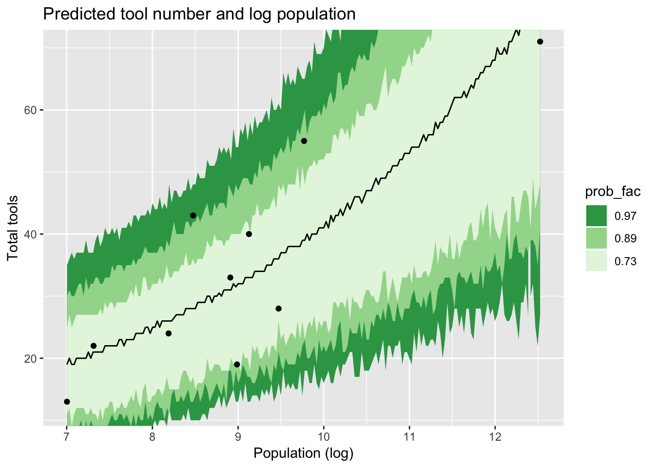
Which is a fair, but hardly exact, match for figure 12.6 in Rethinking. In fact, I was confused about this too, and actually asked about it on stackoverflow. It turns out that the jagged shape is simply sampling error. Of course, as Gavin pointed out on Twitter (and is quoted in the answer there) smooth lines are possible if we ask for fitted, not predicted values. I didn’t do that, because I wanted to stick to what the book had done.
I want to talk a bit about two arguments to add_predicted_samples above: re_formula and allow_new_levels. Although these are arguments to tidybayes::add_predicted_samples, that function just passes them straight to brms::posterior_predict (or, in the case of tidybayes::add_fitted_samples, to brms::posterior_linpred). So we need to look there to find them documented. Now I am an enormous fan of brms, but I must say that the help file here was at first a source of great confusion for me:
re_formulaformula containing group-level effects to be considered in the prediction. If NULL (default), include all group-level effects; if NA, include no group-level effects.
allow_new_levels
A flag indicating if new levels of group-level effects are allowed (defaults to FALSE). Only relevant ifnewdatais provided.
When I first read this, I didn’t understand the word “include”. How does that map on to McElreath’s three cases above? Could not all three be said to “include” the group-level effects, in one way or another? Curiouser: re_formula can be a formula (okay) or NA (loosely translated: nothing) or NULL (loosely translated: less than nothing). Curiouser still: allow_new_levels can be TRUE or FALSE. So that gives us six possible combinations of the two different arguments – or even more, if you consider that the formula could omit a random effect, but include others. But if you omit it, is that closer to the NULL or to the NA effect?
A stormy sea indeed.
Perhaps the best way to understand this is by demonstration! Fortunately the tidybayes website contains some code to build a simple, easy-to-play-with model that I used to help me study how this works:
Stepping through the vignette for tidybayes
We begin by sampling some data from five different “conditions”:
set.seed(5)
n <- 10
n_condition <- 5
ABC <-
  data_frame(
    condition = rep(c("A", "B", "C", "D", "E"), n),
    response = rnorm(n * 5, c(0, 1, 2, 1, -1), 0.5)
  )

ABC %>%
  ggplot(aes(y = condition, x = response)) +
  geom_point(pch = 21, size = 4, stroke = 1.4, fill = "#41b6c4")
And by fitting a model to these data, with varying intercepts for each group:
m <- brm(
  response ~ (1 | condition), data = ABC,
  control = list(adapt_delta = .99),
  prior = c(
    prior(normal(0, 1), class = Intercept),
    prior(student_t(3, 0, 1), class = sd),
    prior(student_t(3, 0, 1), class = sigma)
  )
)
An easy way to visualize these results is with a so-called “joyplot”4
ABC %>%
  data_grid(condition) %>%
  add_predicted_draws(m) %>%
  ggplot(aes(x = .prediction, y = condition)) +
  geom_density_ridges(fill = "#41b6c4") +
  theme_minimal()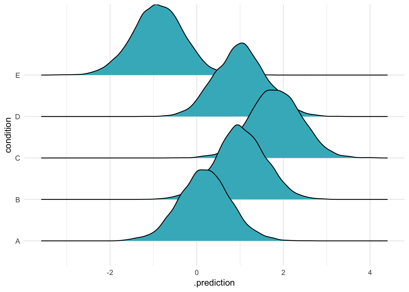
Alright. This used the simple vanilla option, add_predicted_samples(m). This uses the default options for making predictions, which recall is “NULL (default), include all group-level effects”. If you set add_predicted_samples(m, re_formula = NULL) (try it!), you’ll get exactly the same figure.
So we can see that to “include” an effect is to take the actual estimated intercepts for each specific group we studied and use them to make new predictions for the same groups. This is Case 1 from McElreath’s list (though in this case, because we only have groups and nothing else, Case 1 and 2 are the same).
We can also say the exact same thing using a formula:
ABC %>%
  data_grid(condition) %>%
  add_predicted_draws(m, re_formula = ~(1|condition)) %>%
  ggplot(aes(x = .prediction, y = condition)) +
  geom_density_ridges(fill = "#41b6c4") +
  theme_minimal()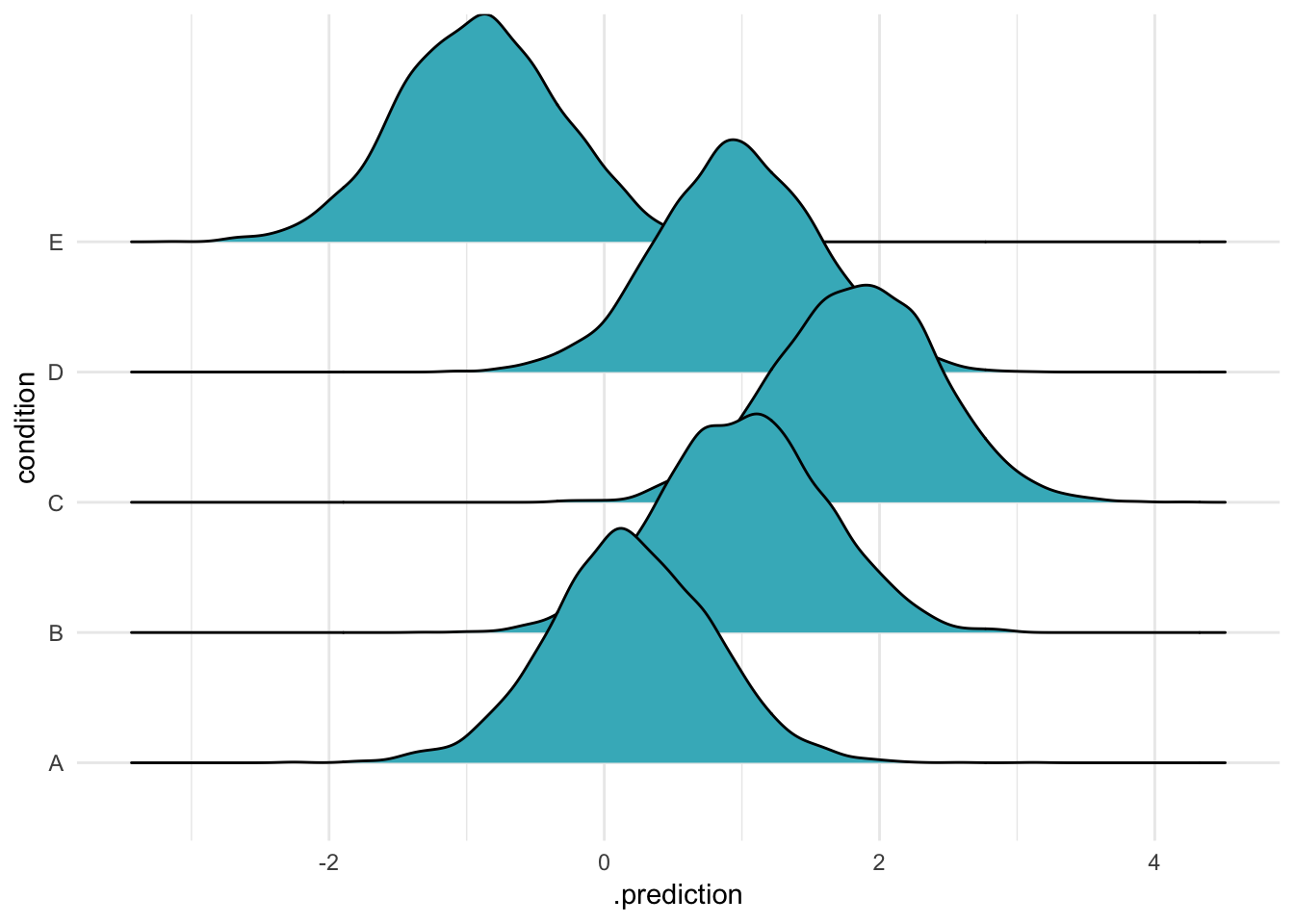
That’s right, there are three ways to say the exact same thing: say nothing, say NULL, or say the original “random effects” formula5. You go with what you feel in your heart is right, but I prefer the formula.
In all three cases, we are using the model to predict the means for the groups in our varying-intercepts model. This is what the documentation means by “including” these varying intercepts.
Squishing those random effects
OK so that was three separate ways to make predictions for the same groups. What else can we do? Let’s try that thing with the NA argument, which means “include no group-level effects”:
ABC %>%
  data_grid(condition) %>%
  add_predicted_draws(m, re_formula = NA,
                        n = 2000) %>%
  ggplot(aes(x = .prediction, y = condition)) +
  geom_density_ridges(fill = "#41b6c4") +    theme_minimal()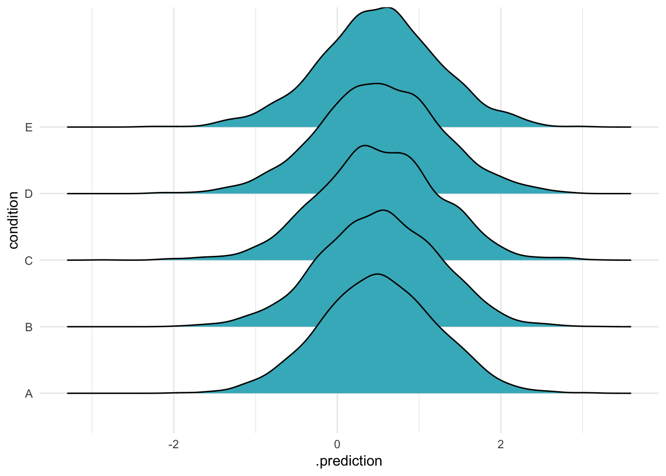
Ah, so if you do this, all the groups come out the same! But if they’re all the same, what do they represent? It seems reasonable that they represent the model’s intercept, as if the varying intercepts were all 0. Let’s calculate predicitons that ignore the varying effects – that is, using only the model intercept and the standard deviation of the response – using a bit of [handy purrr magic]6:
m %>%
  spread_draws(b_Intercept, sigma) %>%
  mutate(prediction = rnorm(length(b_Intercept), b_Intercept, sigma),
         #map2_dbl(b_Intercept, sigma, ~ rnorm(1, mean = .x, sd = .y)),
         Prediction = "prediction") %>% #glimpse %>%
  ggplot(aes(x = prediction, y = Prediction)) +
  geom_density_ridges(fill = "#41b6c4") +
  theme_minimal()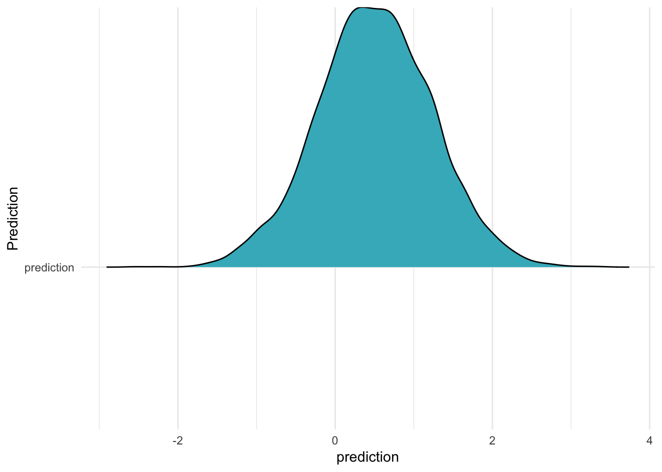
As you can see, this distribution has exactly the same shape as the five in the previous figure! It is as if we calculated the predictions for a group which was exactly at the average (in other words, it had a varying intercept of 0.) In the Rethinking book, readers are taught to do this in a much more explicit way: you actually generate all the 0 intercepts yourself, and give that to the model in place of the estimated intercepts! A very manual and concrete way to “set something to 0”.
brms does this too. As the documentation says
>NA values within factors in newdata, are interpreted as if all dummy variables of this factor are zero.
The brms phrasing certainly takes less space, though it also requires you to remember that this is what NA gets you!
We can also remove random effects from our predictions by excluding them from the re_formula. In our model, we have only one varying effect – yet an even simpler formula is possible, a model with no intercept at all:
ABC %>%
  data_grid(condition) %>%
  add_predicted_draws(m, re_formula = ~ 0,
                        n = 2000) %>%
  ggplot(aes(x = .prediction, y = condition)) +
geom_density_ridges(fill = "#41b6c4") + theme_minimal() 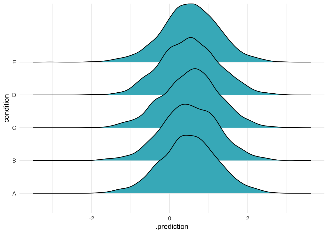
Once again, the same distribution appears: it is as if all group effects had been set to zero. If we had two random effects and omitted one, this is what we would get for the omitted effect – the expected value if all its effects were 0.
New levels
I’m going to show how to create predictions for new levels, but first I’m going to show two mistakes that I made frequently while learning:
First, asking for new levels without specifying allow_new_levels = TRUE:
# this does not work at all!!
data_frame(condition = "bugaboo") %>%
  add_predicted_draws(m, re_formula = ~(1|condition),
                        n = 2000)
## Error: Levels 'bugaboo' of grouping factor 'condition' cannot be found in the fitted model. Consider setting argument 'allow_new_levels' to TRUE.That fails because I tried to pass in a level of my grouping variable that wasn’t in the original model!
Second, passing in new levels – but telling the function to just ignore them:
data_frame(condition = "bugaboo") %>%
add_predicted_draws(m, re_formula = NA,#~(1|condition),
n = 2000) %>%
ggplot(aes(x = .prediction, y = condition)) +
geom_density_ridges(fill = "#41b6c4") +
theme_minimal()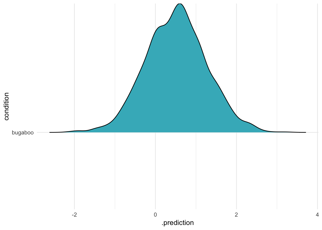 Here, i’m still passing in the unknown level – but the function doesn’t complain, because I’m not including random effects at all! This is the same result from above, when we used
 NA or ~0 to remove varying effects altogether. This is definitely something to watch for if you are passing in new data (I made this mistake, and it cost me an afternoon!)
If we avoid both of these errors, we get what we expect: our means for our original groups, and a new predicted mean for "bugaboo":
ABC %>%
  data_grid(condition) %>%
  add_row(condition = "bugaboo") %>%
  add_predicted_draws(m, re_formula = ~(1|condition),
                        allow_new_levels = TRUE,
                        n = 2000) %>%
  ggplot(aes(x = .prediction, y = condition)) +
  geom_density_ridges(fill = "#41b6c4") +    theme_minimal()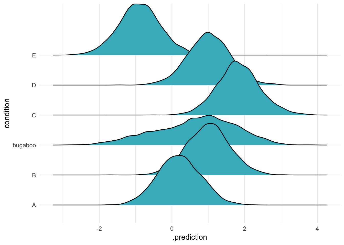
Here you can see that the new level is much flatter than the other original five. It comes from the same population as the others, which is rather variable (the group means are sort of different to each other). As a result, this new distribution is quite wide, including all that uncertainty.
An ecologist might do something like this if we were had data on some species in a community, but wanted to make predictions for new, as yet unobserved, species we might find next year.
More than one group: experiment with chimps
In my last, much longer demonstration I’m going to reproduce figure 12.5 from Stastical Rethinking. This figure plots the results of an experiment involving different individual chimps (actors) who experience different treatments. The experiment also contains blocks, and the model fits varying intercepts for both actors and blocks. Variation among actors is quite considerable, and the figure demos three ways to display this: First, the expected mean for the average actor, then the prediction for a new actor, and finally 50 new simulated actors. This code puts together all the things I’ve talked about so far, and assembles the figure with the hot new patchwork package by Thomas Lin Pedersen!
data("chimpanzees", package = "rethinking")

chimp_bf <- bf(pulled_left ~ 0 + intercept + prosoc_left + condition:prosoc_left + (1|actor) + (1|block),family = "bernoulli")

# get_prior(chimp_bf, chimpanzees)

chimp_priors <- priors <- c(set_prior("normal(0, 10)", class = "b"),
            set_prior("cauchy(0, 1)", class = "sd"))

chimp_brms <- brm(chimp_bf, prior = chimp_priors, data = chimpanzees)
post_process <- . %>%
mean_qi(.width = 0.8) %>%
unite(combo, prosoc_left, condition, sep = "/") %>%
ungroup %>%
mutate(combo = factor(combo, levels = c("0/0", "1/0", "0/1", "1/1")))
# the average actor
avg_chimp <- chimpanzees %>%
data_grid(prosoc_left, condition) %>%
# NA ==> average actor
tidybayes::add_fitted_draws(model = chimp_brms, re_formula = NA) %>%
post_process
plot_avg_chimp <- avg_chimp %>%
ggplot(aes(x = combo, group = 1, y = .value, ymin = .lower, ymax = .upper)) +
geom_ribbon(fill = "#78c679") +
geom_line() +
ylim(c(0, 1)) +
theme_minimal() +
labs(title = "Average actor",
x = "")
# marginal of chimp
marginal_chimp <- chimpanzees %>%
data_grid(prosoc_left, condition) %>%
# leave out part of the random effects formula == replace that part with all 0s
tidybayes::add_fitted_draws(model = chimp_brms,
allow_new_levels = TRUE,
re_formula = ~
(1|actor)# +
# (1|block)
) %>%
post_process()
plot_marginal_chimps <- marginal_chimp %>%
ggplot(aes(x = combo, group = 1, y = .value, ymin = .lower, ymax = .upper)) +
geom_ribbon(fill = "#78c679") +
geom_line() +
ylim(c(0, 1)) +
theme_minimal()+
labs(title = "Marginal of actor",
x = "")
# 50 simulated chimps
plot_fifty_chimps <- chimpanzees %>%
data_grid(prosoc_left, condition) %>%
# NA ==> average actor
tidybayes::add_fitted_draws(model = chimp_brms,
allow_new_levels = TRUE,
n = 50,
re_formula = ~
(1|actor)# +
# (1|block)
) %>%
unite(combo, prosoc_left, condition, sep = "/") %>%
ungroup %>%
mutate(combo = factor(combo, levels = c("0/0", "1/0", "0/1", "1/1"))) %>%
ggplot(aes(x = combo, group = .draw, y = .value)) +
geom_line(alpha = 0.7) +
ylim(c(0, 1)) +
theme_minimal()+
labs(title = "50 simulated actors",
x = "")
plot_avg_chimp + plot_marginal_chimps + plot_fifty_chimps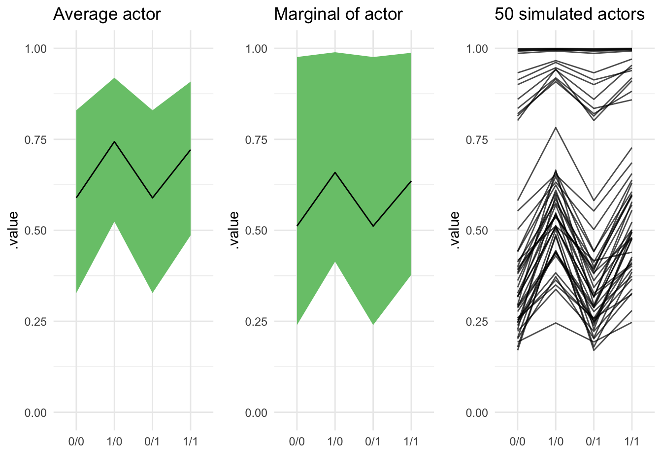
Hi, Richard, if your reading this: huge fan here. I uh, really hope this doesn’t constitute some kind of copyright problem? If so just let me know and I’ll change it↩
what we’d expect see in count data, indeed. If you have ever seen count data in Nature that was actually distributed as a Poisson, please leave a comment in order to claim your prize!!↩
not without more information; that’s why overdispersion is sad – you needed more information↩
in writing this I came to realize that joyplots are over; we do ridgelines now. Also Claus Wilke is one hell of a blogger, definitely going to start reading him!↩
this impulse in R to “help your users” by making it possible to say a great deal by saying almost nothing is… actually pretty counterproductive, I’d argue? But that’s a different post↩
no magic required!
rnormis already vectorized↩